Pages

Tuesday, September 15, 2015

Halloween Triple Easel Card

The plan was that we would add a satellite TV outlet in the family room so that DH could watch football while I sat in the lounge and watched DWTS.  Unfortunately, the couch in the family room is covered, and I mean COVERED in books that need to be sorted and delivered to Goodwill. So we both watched football.  Fortunately, I was able to play on Design Space at the same time and create a triple easel Halloween card for my eldest DGD.   Here it is!


I followed the tutorial from SplitCoastStampers here, and added three pumpkins sized at 3 inches, 4 inches and 5 inches.  I ungrouped the shadow layer of a pumpkin, and duplicated it.  I used a square to slice away the stalk of the pumpkin and then duplicated the resulting shape.  I flipped the duplicate pumpkin vertically and welded the two stalkless pumpkins together. 


I changed the color of the stalk to green and added a leaf.  I repeated this process with the other two pumpkins.  Then I decided that I needed a carved face on the pumpkins, so sliced in spooky faces from the Pumpkin Carvings cart.   Then I decided that I needed some children in Halloween costumes peeking out besides the pumpkins, so added three characters from the Trick or Treat cart.  Enough!!!!  One last step was to add "Boo" as the stop for the front card.


 Here's the DS file number if you would like to replicate the card.  : )

https://us.cricut.com/design/#/canvas/31290037

The challenge over at BBTB2 this week is to create a project with imaginary characters.   I LOVE what the DT came up with!

The challenge at FCCB is to create a project for a kid.  What a fun idea!   Pop over and take a look at the creative designs.

Thanks for visiting with me today!   : )  Christine

Saturday, September 12, 2015

Creepy Critters!

We're in Gig Harbor WA for a few days with DH's Flyfishing Club to do some surf fishing - 'pinks' I think he said.  All I know is that he tied some very sweet little pink and orange flies that he did not appreciate me calling "pretty!" 

While the guys were out, my friend C and I got together for a Craft 'n Chat session assembling these cuuuute little Halloween treat bags from the new Cricut cart 'Creepy Critters.'


I sized the bags to cut at 3 inches when flat - 5.23 wide and 6.1 high per group - and they hold 4 pieces of candy quite comfortably.  In fact, these little bags are so easy to arrange on a page so as not to waste any cardstock and so easy to assemble, that I am sure I will be redecorating them to use for baby showers, wedding showers, birthdays, and for Valentine and Christmas treats.


I added my favorite CTMH stamp on the back - the one that goes perfectly on a 1" scalloped punch!


Well, time to get ready for the potluck.  TTYL!  Thanks for visiting sunny Gig Harbor with me today.  : )  Christine

Wednesday, September 9, 2015

Playing With a Fall Gap Card!

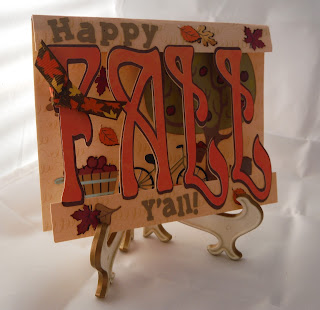
I love all the 'scene' cards that are out there in blogland, but know that even with my Misti, I could never ever get everything lined up, masked, inked and positioned correctly.  But I can, sorta, kinda create a 'scene' with the Print 'n Cut feature of the Explore!  And here it is:-


I started with a gap card (directions here) and made the gap 2.86 inches wide to allow the 'scene' to peek through. The card stock comes from DCWV Pumpkin Patch and proved to be rather difficult to fold correctly even with the score line.  I had to manually score on top of the line the score tool made.  Ughhh!

It was fun choosing the images to go inside the card and arranging them to make a pleasing scene.  Can you see Katie in there?  


Wouldn't this be fun with the word 'Noel' and a Christmas scene inside?  Or 'Birthday' with cake, balloons and presents inside?

 I used Art Nouveau for the word 'Fall' and Birthday Bash for 'Happy' and 'Y'all!'   The other carts I used are Country Life, Pop Up Neighborhood,  Summer Celebrations, and Pet Shop.  I selected the leaves from the Sesame Street Seasons cart, but there are tons of other leaf images in DS if you do not have this cart.

Here's the file for the card

https://us.cricut.com/design/#/canvas/31000571

and for the card without embellishments

https://us.cricut.com/design/#/canvas/31103598

One last peek at my oh so flat card ready to mail!:-

 Thanks for visiting with me today.  : )  Christine

Sunday, September 6, 2015

Back to School

Last week was Back to School week for our local School District and a VERY good time for me to be camping in the RV!  This was Katie's first trip and our friends laughed and told us we sounded like new parents after we delightedly told them that she had stayed in her bed and slept the whole night through!  Of course, I think it was Cocoa's good example, right?

One of the things a teacher must think through is how to manage supplies.  I was thinking about the Master J's little desk and how to organize his pencils when I remembered the candy cane holder from SVG Cuts.  I didn't want any thing so big and gingerbready looking, so off I went into DS looking for a school house with a roof.  I found a very plain one among the images in Classroom - August and September.  I added windows and doors from Sweet Tooth Boxes and the trim is my hard working Falling Water punch.  Here's my box: -


I added the last two apple brads from my collection and the Explore wrote the "Sharpened"  and "Pencils to be Sharpened" labels for the sides.  I could not resist popping a Bird Crazy image behind a window!


I am linking my pencil organizer up with the BBTB2 Back to School Challenge here.  There are some fun projects on the blog!

And to the Fantabulous Cricut Challenge Blog here.

Thanks for visiting with me today.  : )  Christine

Monday, August 31, 2015

Bird Crazy Halloween!

I was NOT going to jump on the band wagon and buy the Tim Holtz Crazy Birds even though I think they're fabulous!  Nope.  Don't need them.  Haven't even made one card from the blueprint stamps that I HAD to have. (In my defense, I have practiced water-coloring a few of them  Not a pretty sight!) Then, sigh, Mr. H. introduced the accessory stamps and dies and I pushed the 'Buy' button.


Here's my card:-


If you haven't tried a cascading card before, go here for easy peasy directions from Flowerbug.  The trick is to use a nice heavy 'designer' double sided paper AFTER you have practiced with some old, ugly card stock. 

This was a lovely project to work on a little at a time while it was my turn to watch the puppy. (Just to make sure she was not chewing on her stitches.)  I used my Spectrum Aqua watercolors and a small paint brush to pick up the color from an acrylic block.  I love the vampire owl with his fangs and the HP bird with his wand which is really the paint brush stamp with the brush end cut off!  The sweet little bunny bird's tail is the fluffy ball from the end of the Santa hat stamp.

The sentiments were written with my Explore and say "Trick or Tweet!"  "Happy 'Owl'oween!" and  "Flying by with a witchy "Hi!"  Such a fun, fun card to make.


Thanks for visiting with me today.  I'd better go watercolor some more birds!   : ) Christine


Sunday, August 30, 2015

Friends!

Just a quick, last minute post to share my project for this weeks Bitten By The Bug 2 challenge "Friendship."


A couple of weeks ago, Master J was reeling off the names of his friends to his mama, and he added at the end, "And Grandma is my friend."   Can we have a collective "Awwww?"   Love that little boy!  Anyway, I wanted to make him something to celebrate all his friends and came up with the idea of photo blocks to which he could add little pictures, including, of course, Grandma!

I made little 2 inch pockets with my Fuse tool and adhered them to the boxes with scor tape.  The font is The Mickey Font and I added the characters since Master J is a Mickey Mouse Clubhouse devotee!


Thanks for visiting with me today and please pop back tomorrow to see my blog post for She's a Sassy Lady.  It was the most fun project EVER!  : )  Christine

Thursday, August 27, 2015

Aha! Another Gift Card Holder!

O.K.  Maybe I am a little obsessed with all the varied ways crafters have come up with to give gift cards!  Amy, at 'All Things Beautiful' shared an adorable matchbox pop - up card she made for her nephew and of course, I had to try one too!

I needed a couple of holders for my DGD's gift cards and since their bedrooms were restyled over the summer, I decided to match their room themes rather than the usual pencil, notebook, school bus Back to School theme. 


I followed a You Tube video - here - but be warned, read her comments below the video before embarking on the project.  Just sayin' ...   It was really quite easy and such fun adding the pop up embellishments from Design Space.  I haven't used "Back to the Beach" or "Summer in Paris" forever and I hope this qualifies for the "Old School Challenge #79" at the Cut It Up blog.

Here's a look at the pop - up elements: -


Plenty of room for the gift card: -


(It's a prop, Miss G!  I'm not really giving you a movie gift card.  Haha!)

The monograms on the lids come from the new cart 'Monogram Motifs.'  I can see this becoming one of my favorites.   : )   Thanks for visiting with me today.   : )  Christine


Blogger Template By Designer Blogs